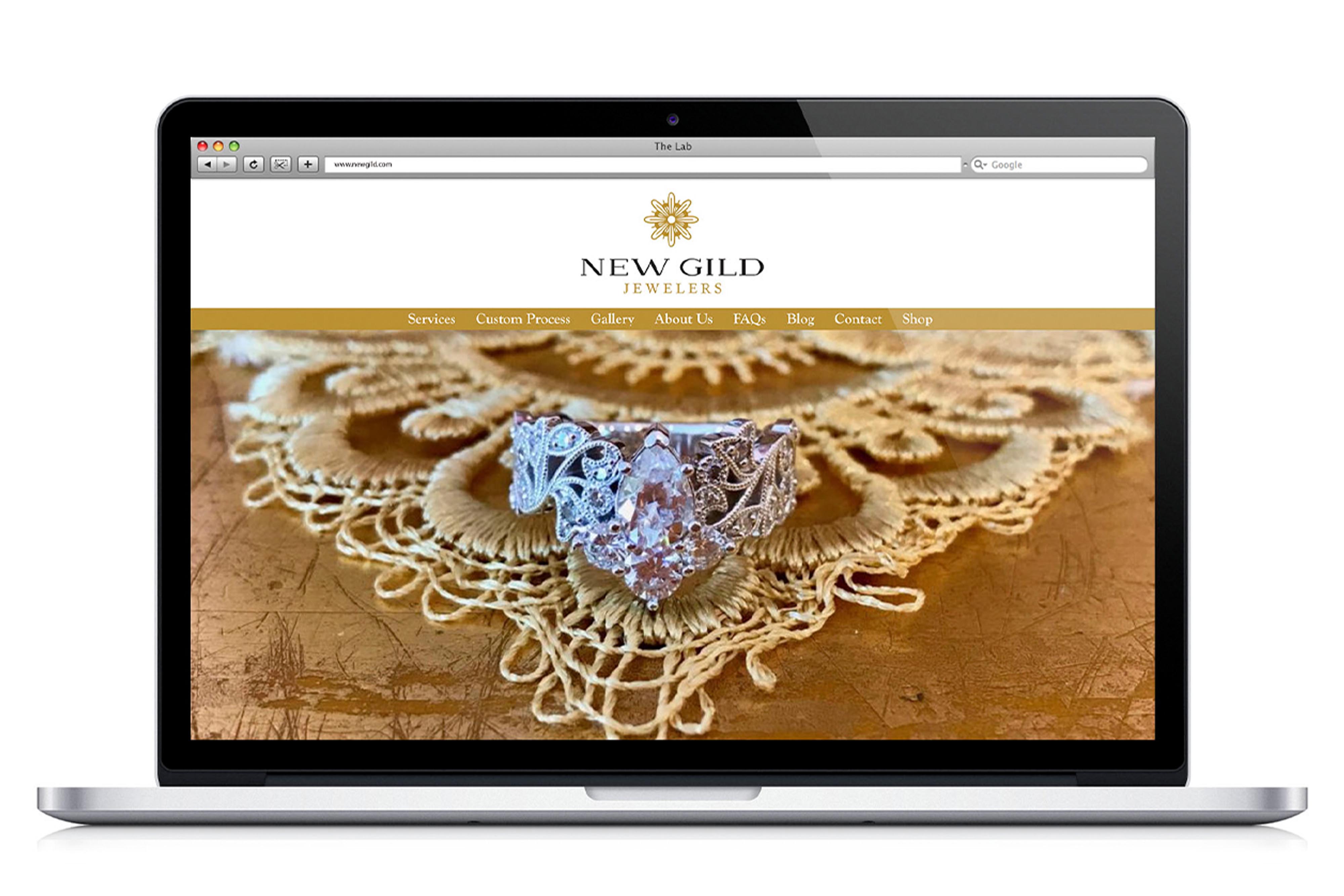
With a focus on custom jewelry and the rich history of the Linden Hills area, where New Gild started, a logo and mark were created. A thinned, wide serif with generous kerning was used to balance the weight when paired with the mark and to draw the eye in. A secondary color was introduced to distinguish hierarchy further and the larger brand at hand. The mark's intricate line work and repetition evoke the sight of the flowers that pepper the Linden trees in the summer, paired together through color yet strong enough to stand alone.
Client
Permanent ADG
Design Team
Creative Director & Visual Designer: Jospeh Belk Visual Designer: Kel Vetter
Role
Typography, Print Ad